
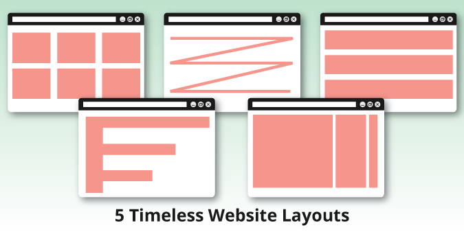
5 Timeless Website Layouts and When They Are Most Effective
Posted on 01/08/2018 at 09:19 AM
It goes without saying that content is king, and although design is simply the means for presenting content, it must be carefully considered in order to display information intuitively. Different layouts can change user behavior, so it is important to consider which design best meets the needs or goals of the website.
Cards / Grid

Card or grid patterns serve as a collection of clickable containers with bite-sized previews. Think about Pinterest—it is an infinite loop of linked cards in a grid. This layout is often image- or graphically-driven and features visual grouping and a clear hierarchy of elements like a title, summary, and button to read more. Consistency is key for a cohesive look with various independent card features. The social media-esque characteristics make it easy to browse. Blogs and ecommerce websites often lend themselves well to this style of website.
F Pattern
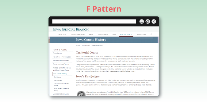
If a website is content-heavy, the F pattern is a good fit because it utilizes our eye’s natural instinct of starting at the top right corner of the screen, scanning horizontally, and dropping down to the next line. The F pattern organizes content into horizontal stacking rows with an accessible means of navigation along the top or left that serves as the layout’s backbone. This is a layout with clear visual hierarchy that users feel very comfortable navigating through.
Z Pattern
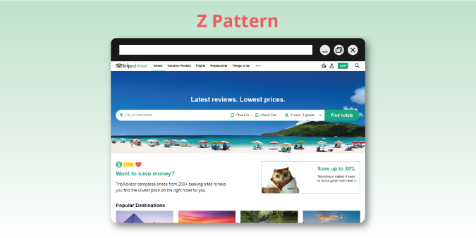
Similar to the F pattern, the Z pattern also accommodates users’ natural scanning tendencies. Between the two, the Z pattern is best suited for websites with less content and a primary goal or call to action. The call to action area is typically positioned at the final point of the Z shape, the bottom right. Pages feature negative space that allows the eye to scan from side to side, while focusing on centered content. There is a rhythmic sense to this pattern.
Symmetrical

Symmetry creates a sense of order and structure that is visually appealing. A balanced layout is straightforward and intuitive with proportional repeated elements. The visual clutter is cleared away for a website with its content at the forefront. Symmetrical design conveys a feeling of stability and harmony in the flow of content. The predictability of symmetrical design lends itself well to content-heavy websites that have lots of information to display, and it also works for minimalist style sites that have a simple aesthetic.
Asymmetrical

When symmetry is broken up, it will grab the user’s attention. An asymmetrical design often features a focal point and evokes feelings of energy, motion, and playfulness. This style is not practical for every client due to its unconventional and modern nature. The asymmetrical layout is best suited to a website with a singular goal like selling a product or promoting an event.
These five layout variations are the building blocks behind most websites you’ll come across. Each one has a different feel to the way it structures the content and leads you through. By establishing the goals for your website, and choosing a corresponding layout, you will be more likely to give users a positive experience and in turn, reach those goals.
Interested in discussing which design will be best for your particular website needs? Contact us today!
Categories: Web Development, Website Tips